How To Get The Best From Your Shop Design
Shop design can make the difference between a great sales day and a bad sales day. A shop design that is going to drive your sales requires planning, maintenance and an understanding of your customers’ pains and desires. At the end of the day, your customers are your target and if they aren’t falling in love with your store and purchasing, there is a problem.
Here are 3 quick-read tips to help you optimise your shop design:
1) Plan Your Zones
If you haven’t been thinking about your shop’s selling zones, you’re missing a trick. If you have but you haven’t looked in a while, then make sure you do another quick analysis. It’s as important to get your displays right the first time, as it is to continue optimising them. You can always be doing something more, and you should never let your shop space become stale.
You may have heard of the selling zones, but here is a quick reminder:
Even in a small shop, there are different zones.
The Platinum Zone
The platinum zone is at the shop entrance. It should include promotional items or items that are high on your customers’ wish list. The platinum zone is key to your shop design, because it pulls customers in from the high street. It should be coupled with the power of your window displays but I will talk about those again later.
Focal Points
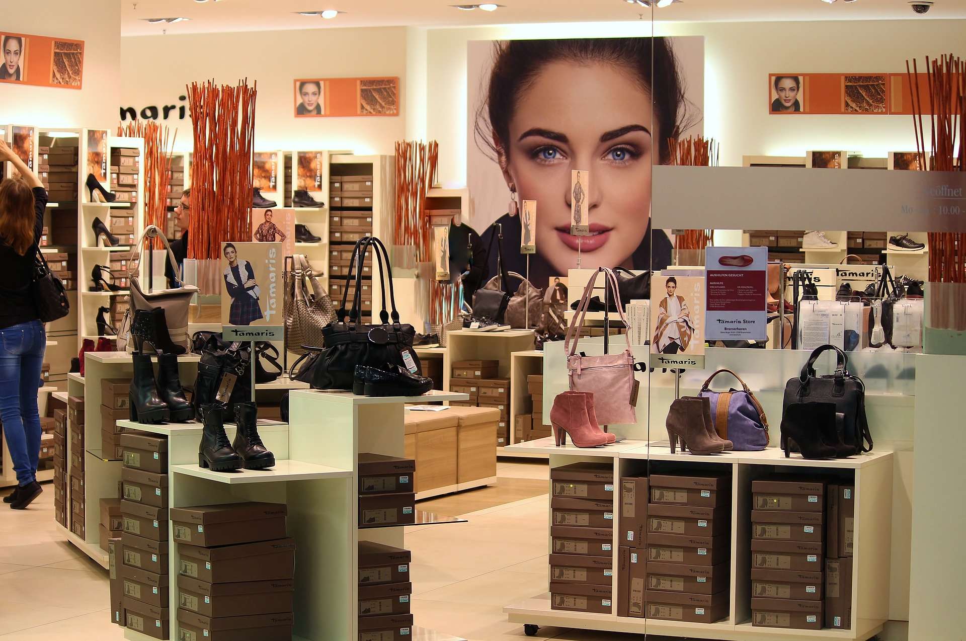
Although the platinum area is one of your primary selling zones, avoid the temptation to overcrowd it. In fact, the front of the store should act as a “warm up”. It should be easily browsed and still allow space for customers to see the key focal points in the store. These focal points are an essential shop design factor, as they encourage customers to browse your store by acting as anchors. These anchors should be made from key things that will catch your customers’ eye and draw them in. For example, in a boutique you may wish to place key brands in your focal points. These focal points should be aesthetically laid out, perhaps including some in store displays using articulated mannequins or bespoke displays.
The Bronze Zone
The bronze area is the furthest from the door and therefore tends to draw fewer customers to it. This is a good reason to ensure that you have a strong brand focal point to use as a powerful anchor. Often larger stores use their shoes or main women’s wear ranges for these anchors. Another common trick is to place the counter here. This encourages customers to browse more of the shop. A strong bronze anchor can be powerful, but only if it is immediately visible from the door. If it is obscured, customers may not realise that the brand is stocked.
In the diagram above, there are 5 focal points pictured, but the number will depend on the size and shape of your space. It is important to consider the number of focal points that are appropriate. Merchandising space is of course valuable and precious in a smaller shop, in these cases retailers could use a unique fixture or a particularly well-lit section with excellent signage to attract attention.
Whatever you do, ensure that spend time planning your store layout.

Enter Your Details To Receive A Copy Of Our Shop Shelving Sheet
2) Shop Fittings & Fixtures
Your shop fittings can help dictate how successful your shop design is. Your fixtures should complement your products, be conducive to your customers’ needs and should also contribute to the overall store environment that you are nurturing. There is also the added strain that your fittings and fixtures cannot be left to become tired or to stagnant. Changing where your fixtures are regularly can help keep your store design fresh, but equally, you don’t want to make your customers play hide and seek with the merchandise. So always ensure that your customers can easily find their way around and that there is a member of staff around to help guide them.
Versatile Systems Help To Keep Costs Low
Some shop display systems can be changed around, with little to no cost at all. These include versatile systems such as slatwall and twin slot systems. Both of these systems allow retailers to simply move the hooks, arms and brackets that slot into the main system. This doesn’t require any tools and is done quickly and easily, allowing retailers the freedom to change things up without having to spend all of their yearly display budget. To read more about slatwall, visit our information page.
Maintenance
Importantly, it is easy to stop noticing that store equipment is beginning to look tired. As retail staff see the fixtures every day, they often do not notice that mannequins are becoming scratched or that there are hangers and shelves that need replacing. A great way to address this is to introduce a monthly check where a staff member walks around the store and does a brief assessment for damages. They should then highlight anything that may need to be replaced soon, in order to keep the store looking its best. This ensures that the displays are appealing to customers and also allows retail managers to keep tabs on their budget as they get some warning as to when they will need to repair or replace something.
Common Issues
Luckily, purchasing fixtures does not have to be expensive as there are many cost effective, aesthetic, options available. There are also many options which are long lasting and therefore do not require continual maintenance. In addition to this, many retailers are concerned about looking after their brand image and finding shop fittings that complement their store design, and that are unique to their store. At The Display Centre we have over 26 years of experience finding solutions to problems like these, so should you need some help, you can call us on 01329 842 000 or email My Display Expert.
Get regular posts like this straight to your email inbox: Send Me Updates!

3) Exceptional Window Displays
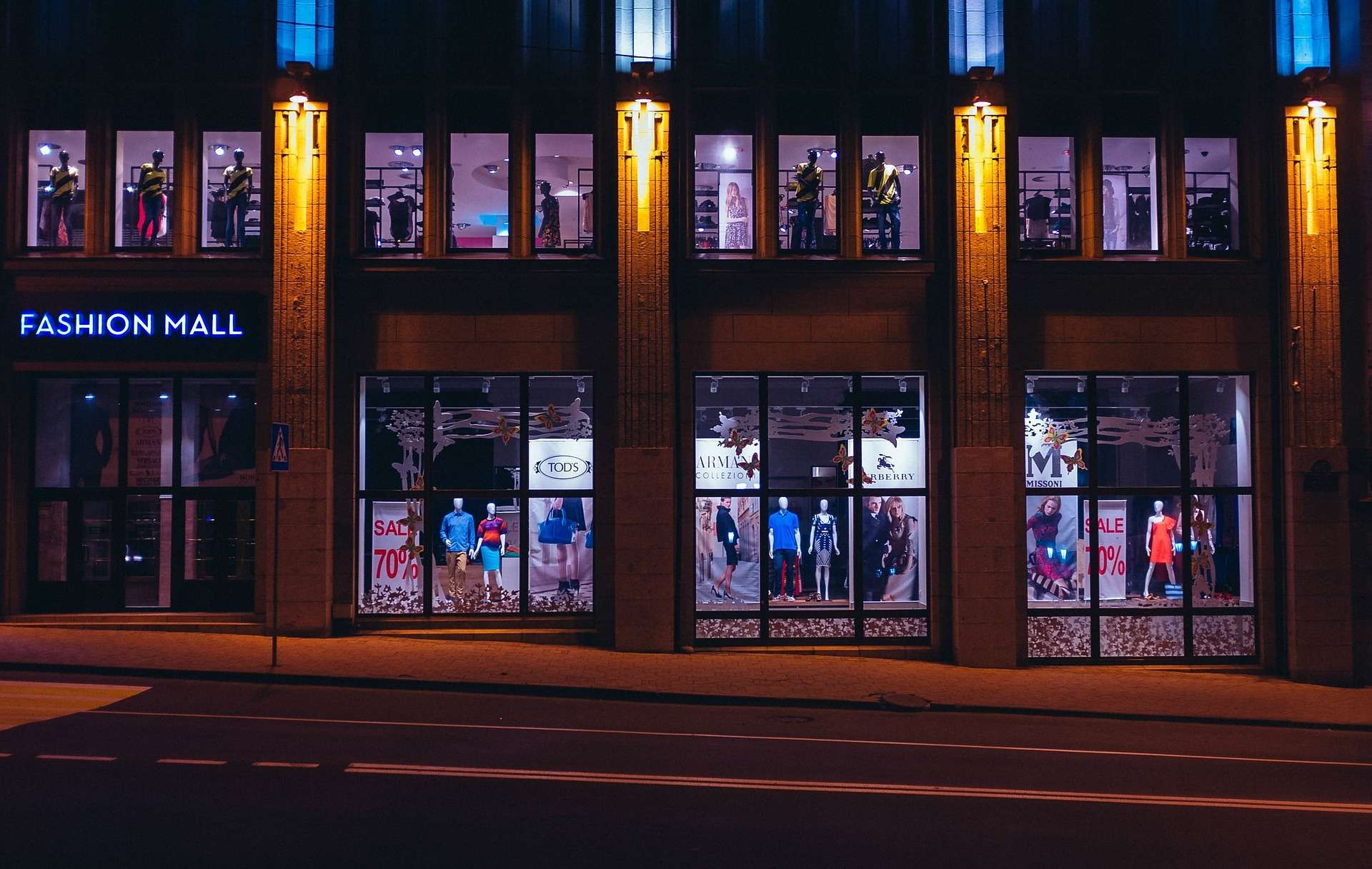
It’s vital that your window displays sell your business’s strengths. Think of it like your brand promise. In the 5 seconds that you have to attract customers who are walking past, what do you want them to know? Your window display is one of the best marketing tools available to a shop owner, it isn’t going anywhere and the only expenditure is setup time and the occasional display prop.
Are You Selling Your Business?
It’s not just your merchandise, it’s your ethos. What is the lifestyle that your customers want to buy into? Is that lifestyle coming across in your window display? If you are running a fashion business, then you need to think about what your clothes are saying. Are they for a fashion-savvy business woman, or for a horse rider? Either way your display needs to tell them what you’re all about.
Similarly, if you are running a promotion on cereal, and you want people to understand that you are offering a real deal, there are things you can do. Firstly, consider your product spacing. If you are giving your products room to breathe, then this naturally leads your customers to infer that the products are premium. If you are promoting a bargain, then the products should be close together and there should be plenty of them. Keep an eye out for this being used and you’ll start seeing it everywhere.
Themes
Keep your window display themes lively and do not let them stay the same for too long at a time. If someone regularly visits the high street, you want to attract their attention every time and make them a regular customer. Select window display props that are seasonal or relevant to a theme. A real winner with boutiques is to select props that create visually exciting window displays and that can later be moved inside to use as in-store displays. Even better, many of these props can be priced up and sold to customers once they have served their window display purposes.
The Three Layer Rule
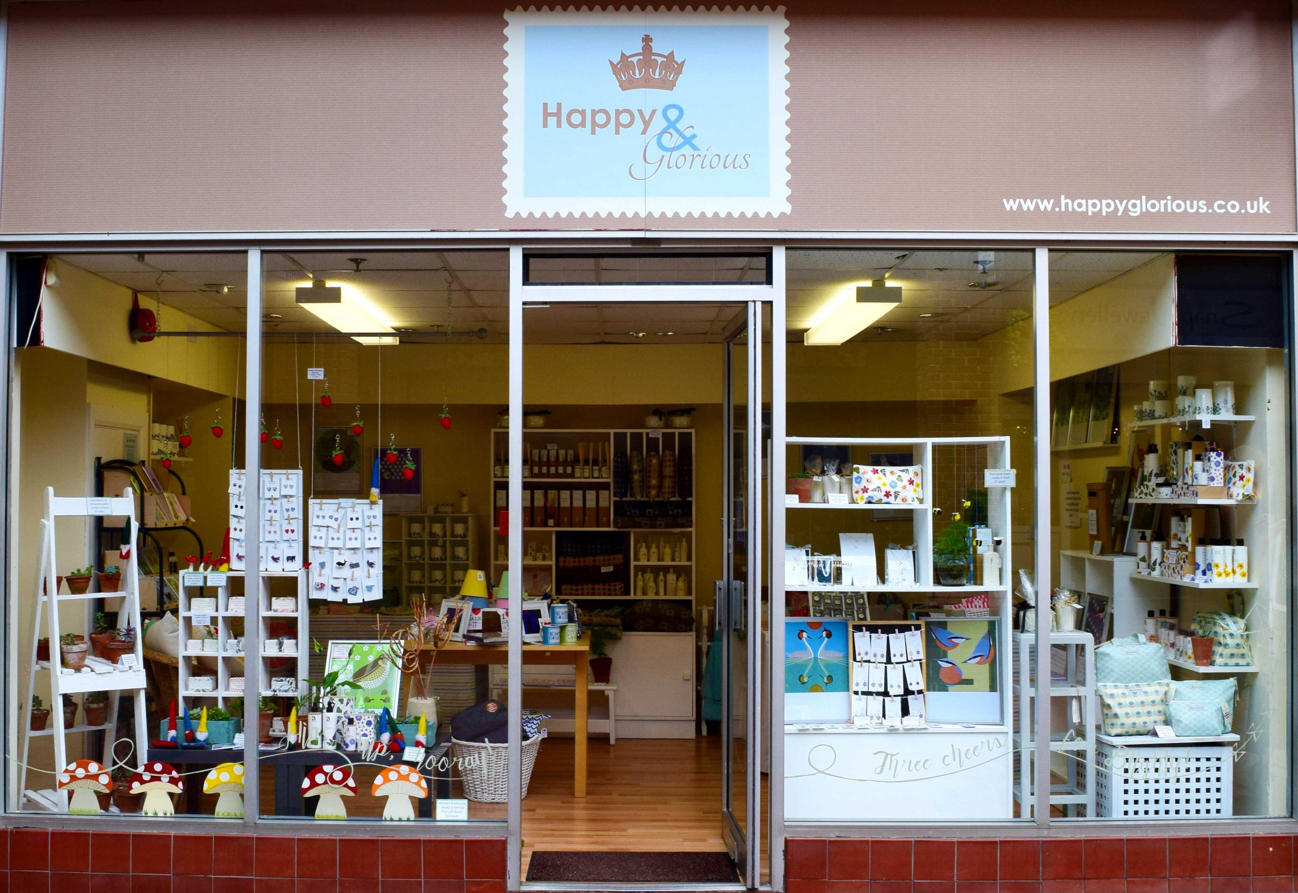
Another popular trick is to use the three-layer rule. This is when 3 layers of depth are created. The first is often some window vinyl graphics. The second is the main event, for example your well-dressed articulated mannequins. The third is an enticing background, even if this ends up being a view into your shop as opposed to a fixed background.
Whatever you do, remember a key focal point, optical balance and strong groupings are important.
An example of the 3-layer rule being used: Happy & Glorious, Park Mall, Ashford, Kent.
This has only been a short summary of a few shop design pointers, find more in our blogs. You can also find inspiration on our Pinterest & Twitter pages.
Get regular posts like this straight to your email inbox: Send Me Updates!
We cater for the giants and the boutiques. From pink mannequins to acrylic leaflet holders, our dedicated team deliver your visual merchandising vision. And the best part? We put our heart and soul into catering to your needs. Why? Because customer service and product display is at the heart of our business, and at the heart of yours.
Call: 01329 842 000 Email: My Display Expert
